Creative Assist Lesson 2: Controlling Contrast and Saturation
Advanced
Here’s an easy way to adjust image colours and create masterpieces ready to share straight out of camera!


- 0
- 0
- 0
Here’s an easy way to adjust image colours and create masterpieces ready to share straight out of camera!
Colour and contrast greatly affect the final look of your shots. With Creative Assist, getting them to look the way you want is just two taps and a slide away! It's perfect for achieving images with your own personal style straight out of the camera, right on the spot. (Photos by: Yuji Ogura, Edited by: Etica)
In Lesson 1, we learned about how we can use Creative Assist to adjust background blur and brightness. In addition, you might want to adjust the colours and tones of your image so that the effect is closer to what you have in mind.
Of course, these changes can be made to your image file after you have taken the shot, using your favourite image editing app. However, with a compressed file format like JPEG, you lose some information every time you edit and resave the file, and this will cause the image quality to degrade.
Creative Assist lets you adjust colours and tones so that you can be sure that the shot looks just the way you want when you snap it. Not only does that keep the image quality intact, you can even share it straight to social media from Camera Connect or image.canon without having to edit it with another app!
"Contrast" refers to the difference between light and dark.
When you set a higher contrast in Creative Assist mode, the bright areas will appear brighter, while the dark areas will be darker, which gives you a photo that “pops” and looks sharper. When you set a lower contrast, there is less difference between the light and dark areas, which makes your photos look less sharp in that aspect.
These differences can also affect your viewers’ impression of your subject—just look at the examples below.
High contrast
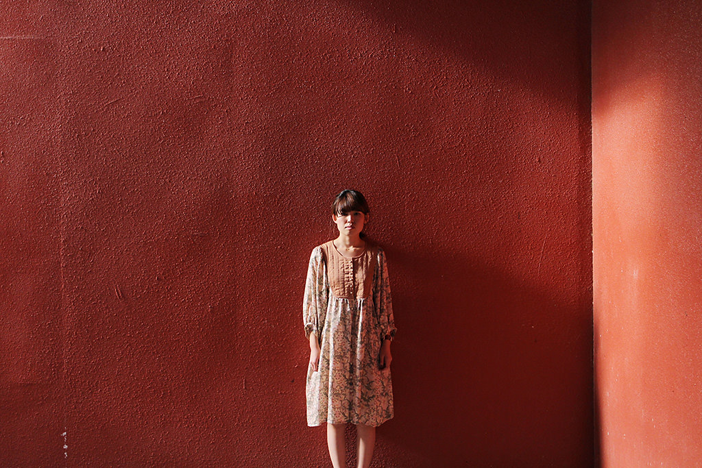
Creative Assist/ Contrast +2
A higher contrast makes the woman appear unfriendly.
Low contrast
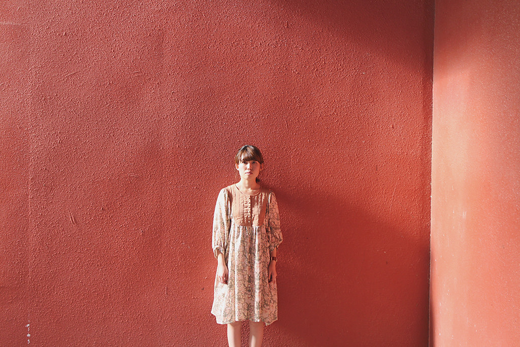
Creative Assist/ Contrast -2
Finishing the photo with a lower contrast makes the photo look a bit “softer” and the woman appear kinder.
(1) Make sure you’re in Scene Intelligent Auto mode
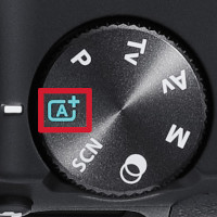
Press the [SET] button next to the LCD screen.
You might see a message. Read the message and select [OK].
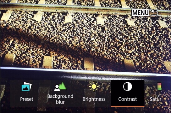
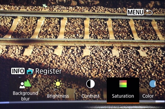
(2) Select the "Contrast" icon
(3) Move the slider to adjust to your preferred contrast settling
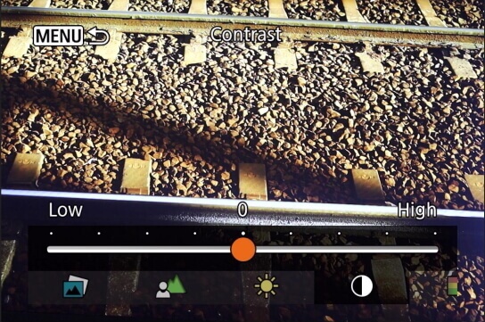
Adjusting toward the “+” side makes your photo look sharper while adjusting toward the “-” side gives it a softer look.
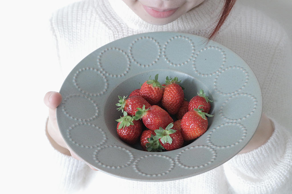
“Saturation” refers to the intensity of colours.
When you want to make the colours of objects such as plants, miscellaneous goods, and buildings more intense, set the intensity towards “Vivid”. This makes the colours stronger.
When you want the colours to look more subdued, set the intensity towards “Neutral”. This makes the colours appear more faded overall.
More intense
Creative Assist/ Saturation +4
More neutral
Creative Assist/ Saturation -4
(1) Make sure you’re in Scene Intelligent Auto mode
Press the [SET] button next to the LCD screen.
You might see a message. Read the message and select [OK].
(2) Select the “Saturation” icon
(3) Move the slider to adjust to your preferred saturation setting
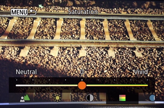
Adjusting toward the “+” side makes photos more vivid, while adjusting toward the “-” side makes it darker.
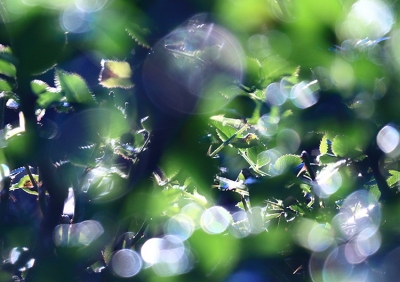
Set a higher contrast to create a cool photo using light and shadow
Creative Assist/ Contrast +3
[Shooting Conditions] Shooting location (weather): Outdoor (sunny), State of light (strength, direction): Strong light / direct light
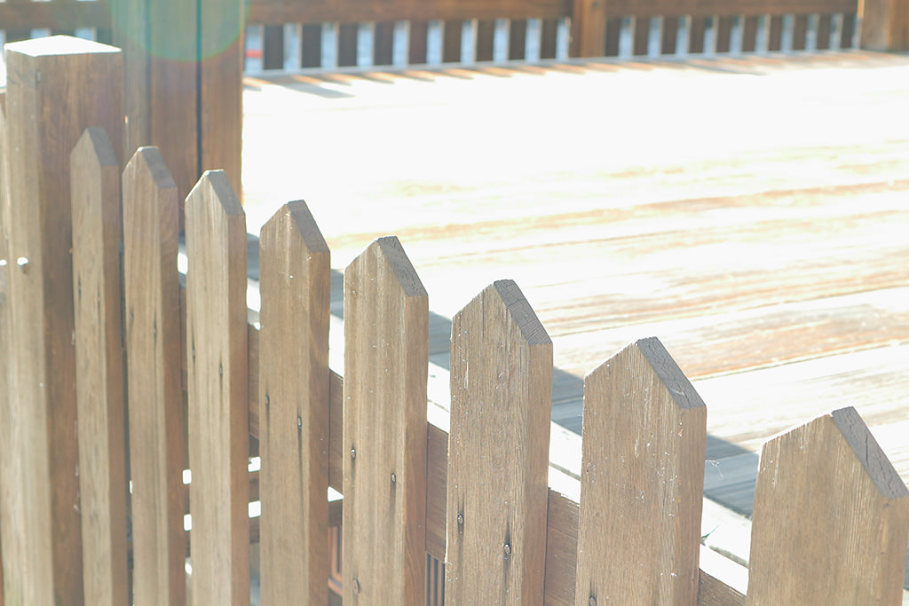
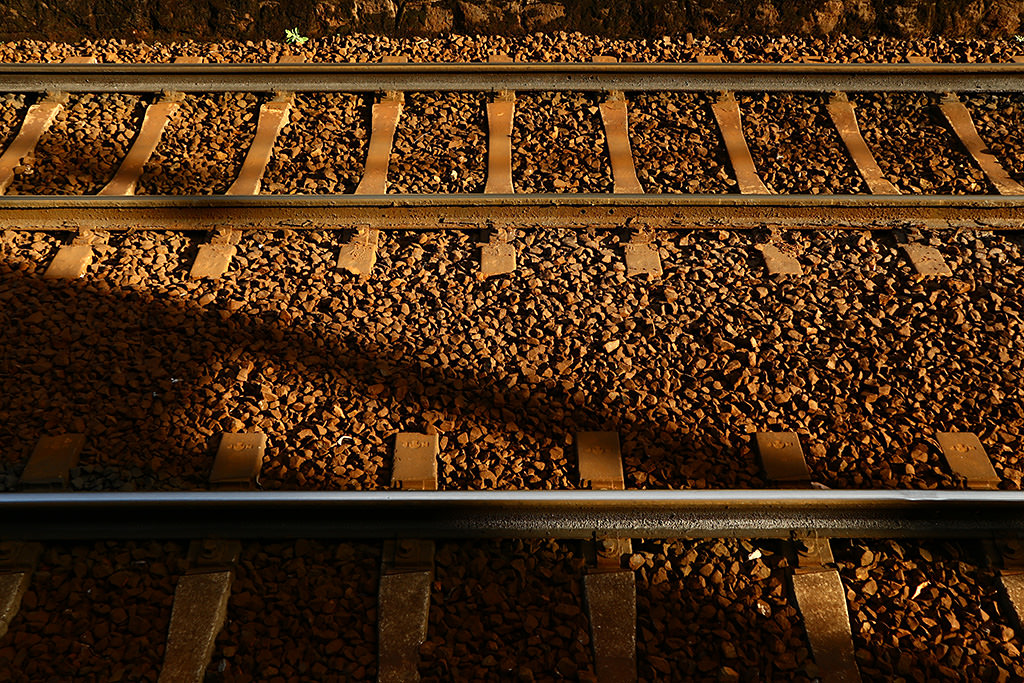
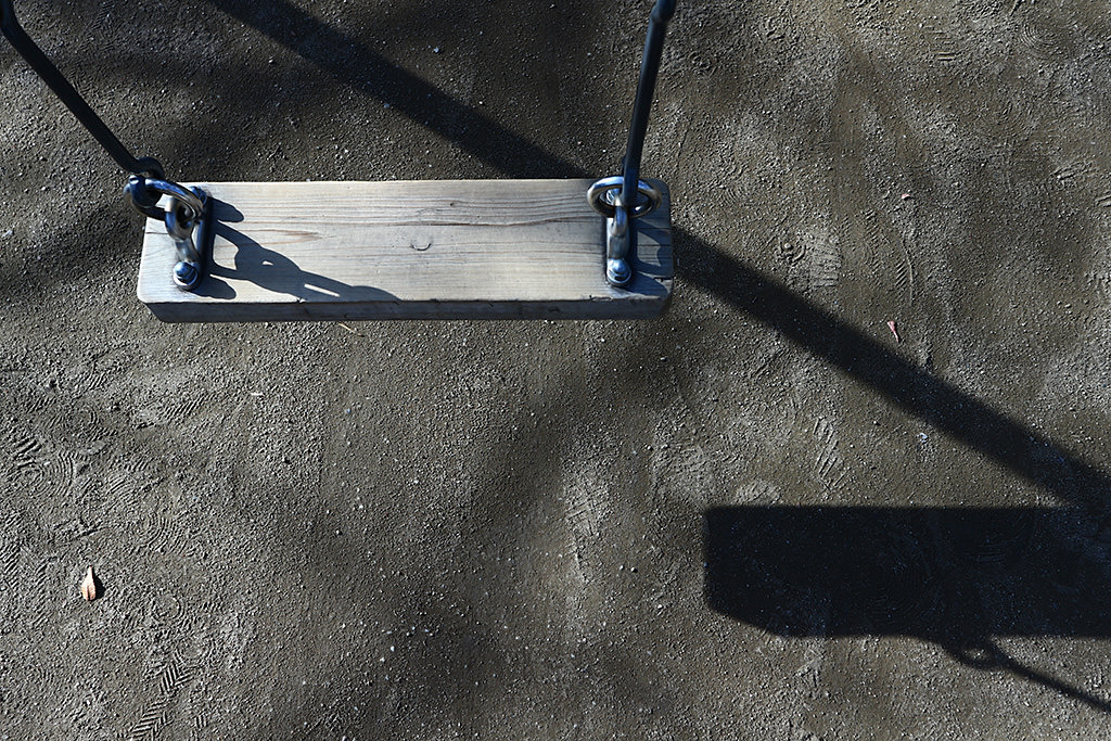
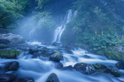
Set a lower contrast to capture shapes of the fence with muted colours
Creative Assist/ Contrast -4
[Shooting Conditions] Shooting location (weather): Outdoor (sunny), State of light (strength, direction): Soft light / slight backlight
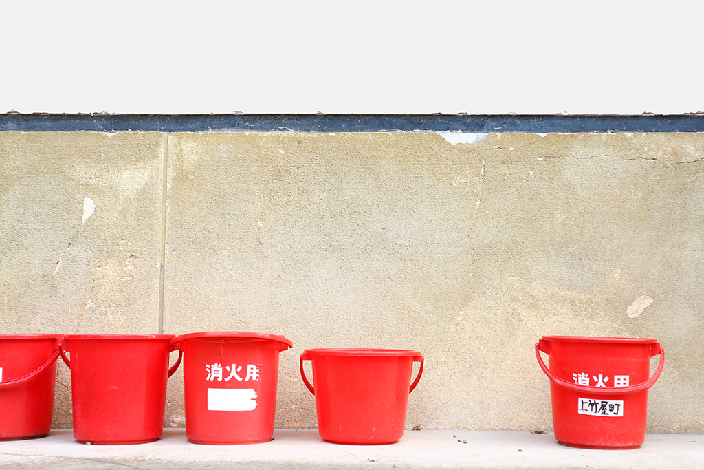
Increasing the saturation enhances the redness of the fire bucket
Creative Assist/ Saturation +2
[Shooting Conditions] Shooting location (weather): Outdoor (sunny), State of light (strength, direction): Soft light / direct light
Reducing the saturation evokes a sense of nostalgia
Creative Assist/ Saturation: -2
[Shooting Conditions] Shooting location (weather): Outdoor (cloudy), State of light (strength, direction): Soft light / slight backlight
When Creative Assist changes the contrast or saturation, it is actually adjusting the Picture Style settings. In more “advanced” shooting modes like Program AE (P) mode or Aperture-priority AE (Av) mode, you can achieve the same effects by adjusting the relevant Picture Style detailed settings.
Find out more about Picture Style and how to use it in:
Camera Basics #10: Picture Style
3 Steps to Creating Custom Photos With Picture Style
Receive the latest update on photography news, tips and tricks.
Be part of the SNAPSHOT Community.
Sign Up Now!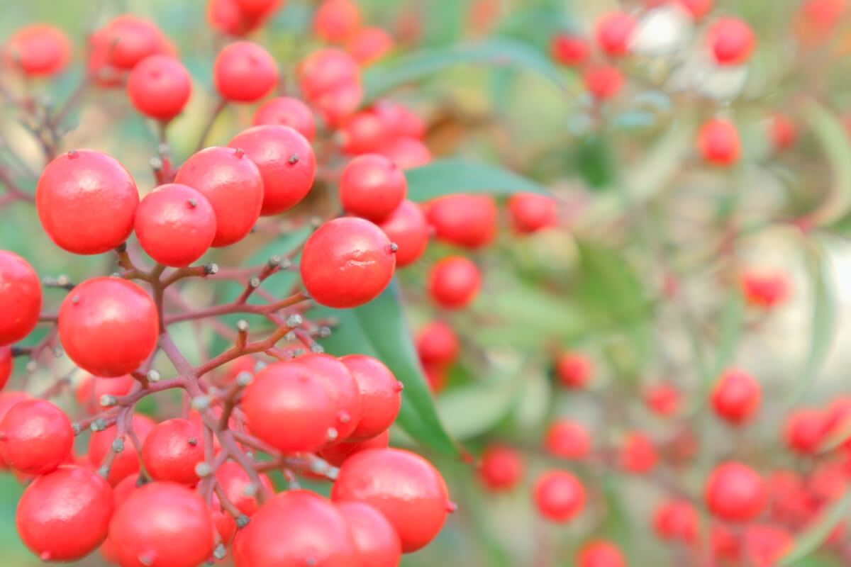
Join the Conversation