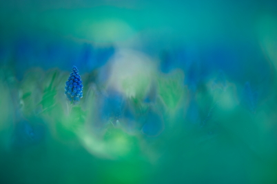
Colour Grading Decisions: Blue Flowers in a Dewy Green Field of Bokeh
Beginner
Colour grading is one way to put the finishing touches on a photograph so that it truly reflects the mood and atmosphere that you want to express. At the same time, it can involve a lot of trial and error before you get the results that you want. Save some time by learning to analyse what you need to do! Yukie Wago takes us step by step through how she colour graded one of her amazing telephoto macro images of flowers that feature deliberately placed creamy background and foreground bokeh. Every picture may be different, but it is eye-opening to learn about the details she pays attention to! (Reported by: Yukie Wago, Digital Camera Magazine)
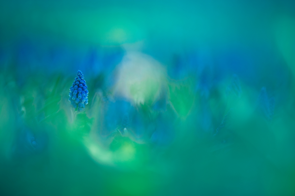
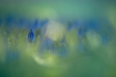
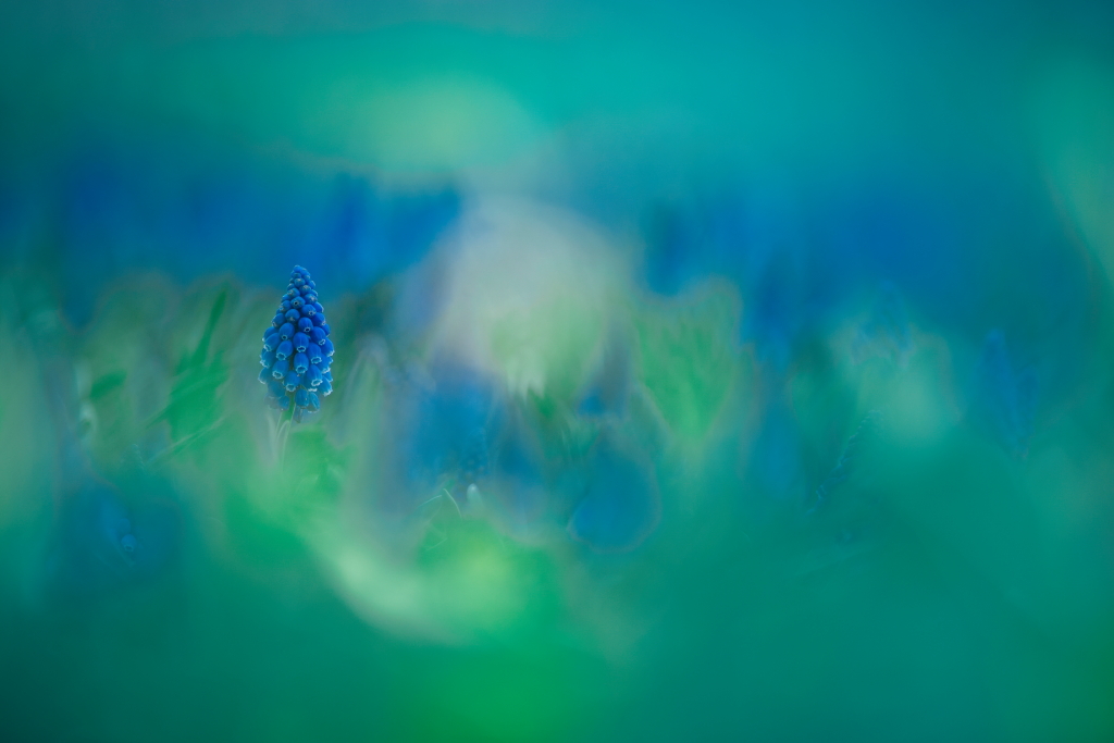
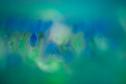
EOS 6D/ EF300mm f/2.8L USM/ FL: 300mm/ Aperture-priority AE (f/2.8, 1/800 sec, EV -0.7)/ ISO 100/ WB: Daylight Plant: Grape hyacinth
& Digital Camera Magazine& Yukie Wago
Published on 20 June 2022 Updated on 29 January 2026
There are times when we shoot first and think how to edit later. But if you shoot with at least a general idea of how you want your final image to look like, it will help with your workflow and lead to better results. (See another example of this in: Handling Natural Light: Telephoto Macro Flowers in the Evening Light)
This photograph shows grape hyacinths, which bloom in early spring. The final image that I envisioned would: - Emphasise the blue of the flowers - Have a clear, dewy quality.
Of course, it would also have my signature look, which is to surround my main subject with beautiful, dreamy bokeh shot at the widest aperture of a telephoto lens—in this case, the EF300mmf/2.8L USM.
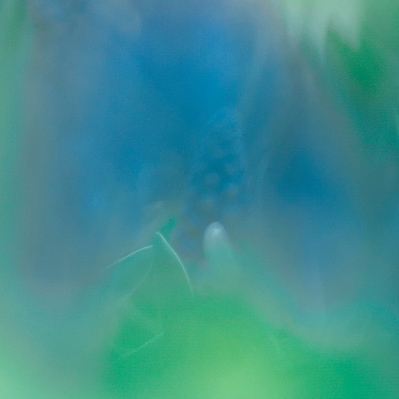
Image before editing
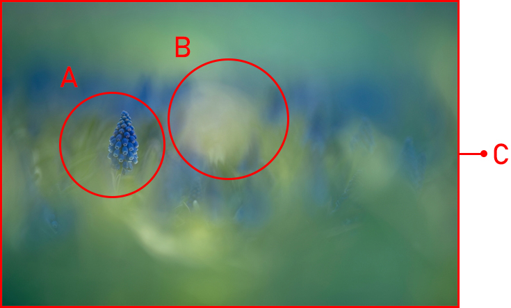
3 things I paid attention to when shooting
A: Maximise the bokeh in all background elements except for the main subject This not only achieves my signature look—having smooth, creamy bokeh also ensures seamless transition between colours.
B: Avoid blown highlights Blown highlights don’t take colour grading well, and would be a glaring distraction from the rest of the image.
C: Make the tones more consistent by limiting the colours in frame To emphasise a colour, you will want to unify the tones of all the colours in the frame so that they are consistent with your selected colour. This is easier to do when there are fewer colours. The more colours you have in the frame, the higher the chances that something will end up looking odd in the process.
In the example above, I adjusted the colours in the image so that they all have the same tones. This is easier to do when there are fewer colours.
In the next few steps, I share how I colour graded the image. The adjustments were done in Adobe Lightroom, but you should be able to find similar tools in other image editing software.
A slight yellowish tint makes the image look murky.
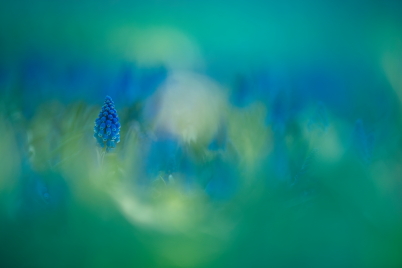
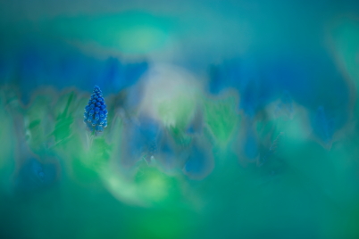
After
After adjustments, the image has just two tones: green and blue.
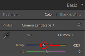
i) Colour temperature: Cooler
To reduce the yellow cast and make the entire image more bluish, I adjusted the colour temperature so that it was cooler.
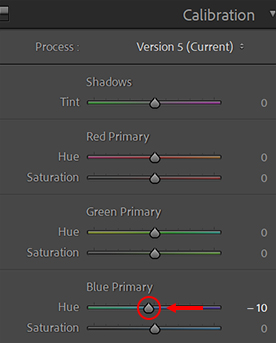
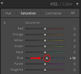
ii) Calibration: Reduce blue primary hues
In digital imaging, colours are expressed using different combinations of red, green, and blue within each pixel. The Calibration tool works at that very fundamental level by adjusting those combinations.
Here, under ‘Blue Primary’, I moved the Hue slider towards the left. This reduces the purple in the image and increases the blue.
Important: Don’t move the Calibration sliders too much! At this stage, we just want to ensure that all colours in the image are bluish in tone. A slight adjustment to remove the yellow cast should be enough—too large an adjustment would affect the next step.
After the adjustments in Step 1, the areas that had a yellow cast now look more bluish. It’s better, but I still haven’t achieved my ideal colours!
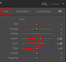
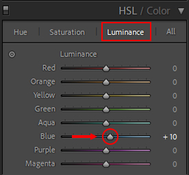
Step 2: HSL—Adjust the greens and blues to the desired shade
i) Hue adjustment
One of the most important yet difficult parts of colour grading is adjusting colours to the desired hues. If you overdo it, it could cause colour jumps, affecting image quality.
First of all, I increased the green hue level so that the green from the leaves would look more bluish. Next, to make the blues appear stronger, I also increased the aqua and blue hue levels.
These adjustments not only completely removed the remaining yellow cast in the image, it also added blue tones to the greens. The overall look achieved the clear, moist feel that I wanted.
Before
After
Pro tip: How much is overdoing it? — Avoiding colour jumps
When shifting hues, pay careful attention to the areas with two or more colours. If you overdo the adjustment, you will get colour jumps, where colours that weren’t originally there will appear. Make your adjustments slow and gradual, and keep checking for unintended results.
Before adjustment
The greens here look a little hazy.
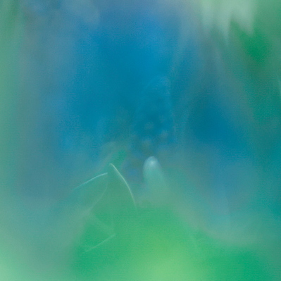
Appropriately adjusted
Adding a little blue to the green gave the image more clarity. Some of the transitions turn slightly greyish, but they are not very obvious and we will fix them in Step 3.
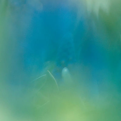
Overdone (colour jump)
Increasing the blue hue level beyond a certain point causes very obvious grey outlines in some transition areas.
Just right
Pushed too far
The background bokeh in both images look straight out of a watercolour painting, but the one on the right looks less well-blended because of the colour jumps.
ii) Saturation adjustment
Before adjusting saturation
After adjusting so that all colours in the image had blue tones, the overall image looked much better, but my main subject looked a little hazy. This was solved by increasing the blue saturation level, which enhanced the colours of the blue grape hyacinths.
Before
After
Tip: Don’t up the saturation level so much that you lose the subtle variations in the shades of blue!
iii) Luminance adjustment
Balancing out the tones and making them more uniform also affects the luminance, which, just like saturation, causes the main subject to look duller. Therefore, I also increased the luminance level of the blues. This gives the overall image more dimension and makes the light look clearer.
Before
Increasing the saturation made the blues deeper.
After
After increasing the blue luminance level, the blue looks brighter and clearer.
Tip: Increasing the luminance too much can cause some parts to become blown out, so adjust with care.
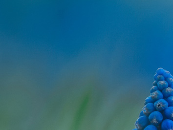
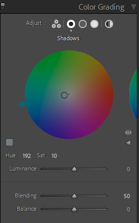
Step 3: Colour grading—Turn the greens in the shadows blue
After the HSL adjustments, there were still parts of the image where the greens and blues didn’t blend very well. So, in the Colour Grading panel, I added blue to the shadows and increased the saturation.
I could have added blue to the highlights too, but that would undo the clarity achieved when I adjusted the luminance level in Step 2. Therefore, I left them alone and adjusted just the shadows.
Before
You can see some “edges” where the green blends into the blues.
After
After adding blue to the shadows, the transitions are more seamless.
In conclusion
Colour grading can make your images more appealing, and once you get to know how they work, the different tools in your image editing software give you a lot of control over outcomes. Flower photographs are very suitable for colour grading, so why don’t you shoot some and give it a try?
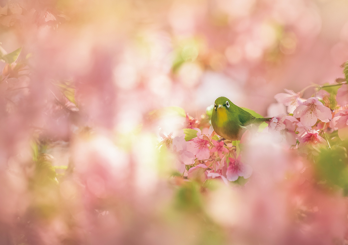
How I Nailed the Shot: A Tiny Green Bird Among Beautiful Pink Bokeh
August 17, 2020
Share
Author
Digital Camera Magazine
A monthly magazine that believes that enjoyment of photography will increase the more one learns about camera functions. It delivers news on the latest cameras and features and regularly introduces various photography techniques.Published by Impress Corporation
Yukie Wago
Based in Fukuoka City, Fukuoka Prefecture, Yukie Wago started shooting with film and toy cameras. Her journey shooting flowers and other living things began when she got her first DSLR camera. Since t


Join the Conversation